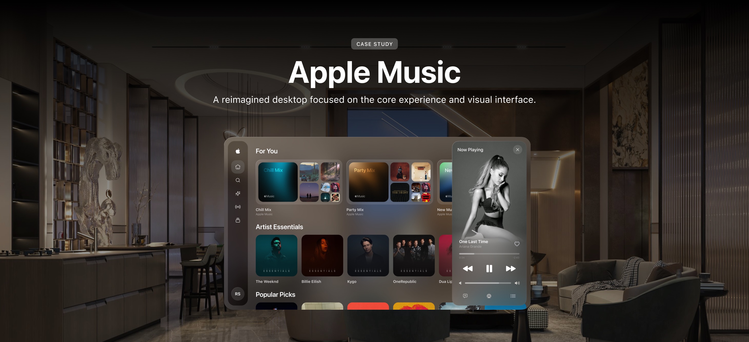
Overview
Problem
Like all music streaming platforms, Apple Music is a service that is used by millions of people around the world. People genuinely love the platform and what it has to offer but there are aspects of it that can be enhanced. The goal was to recreate something that was easier and more seamless to use and provided that sense of improvement sought out by some of their most beloved users.
Solution
I reimagined the desktop version For You section which is
supposed to recommend personalized music. I focused on the core
experience and visual interface.
1. Keeping it
consistent with iOS
2. Revamped Layout
3. Redone
Artwork
4. Multitasking
Timeline
2 weeks
Team
Solo Project
Roles and Responsibilities
I worked through the design process as a sole designer.
Reimagining the experience
DISCOVER
Music is Life
I'm not your ordinary "I listen to music" guy, I religiously listen to music, all kinds too. The focal point of this project was to enhance features, add new ones and improve usability overall to make the service we love even better. I use these music platforms daily, and like many other avid users, I have clear ideas about what we’d love to see on our favorite platforms.
DISCOVER
User Research
I conducted brief interviews with four heavy Apple Music users focusing on the overall interface and new features they would want.

DISCOVER
Secondary Research
I looked at Spotify, a more established music streaming service vs YouTube Music, which is on the rise.

Takeaways:
1. They both lack personalization. None of these services have a multitasking aspect that allow you to create the experience you want.
2. Both of these applications have a consistent user interface and layout with some exceptions throughout their mobile and desktop versions.
DEFINE
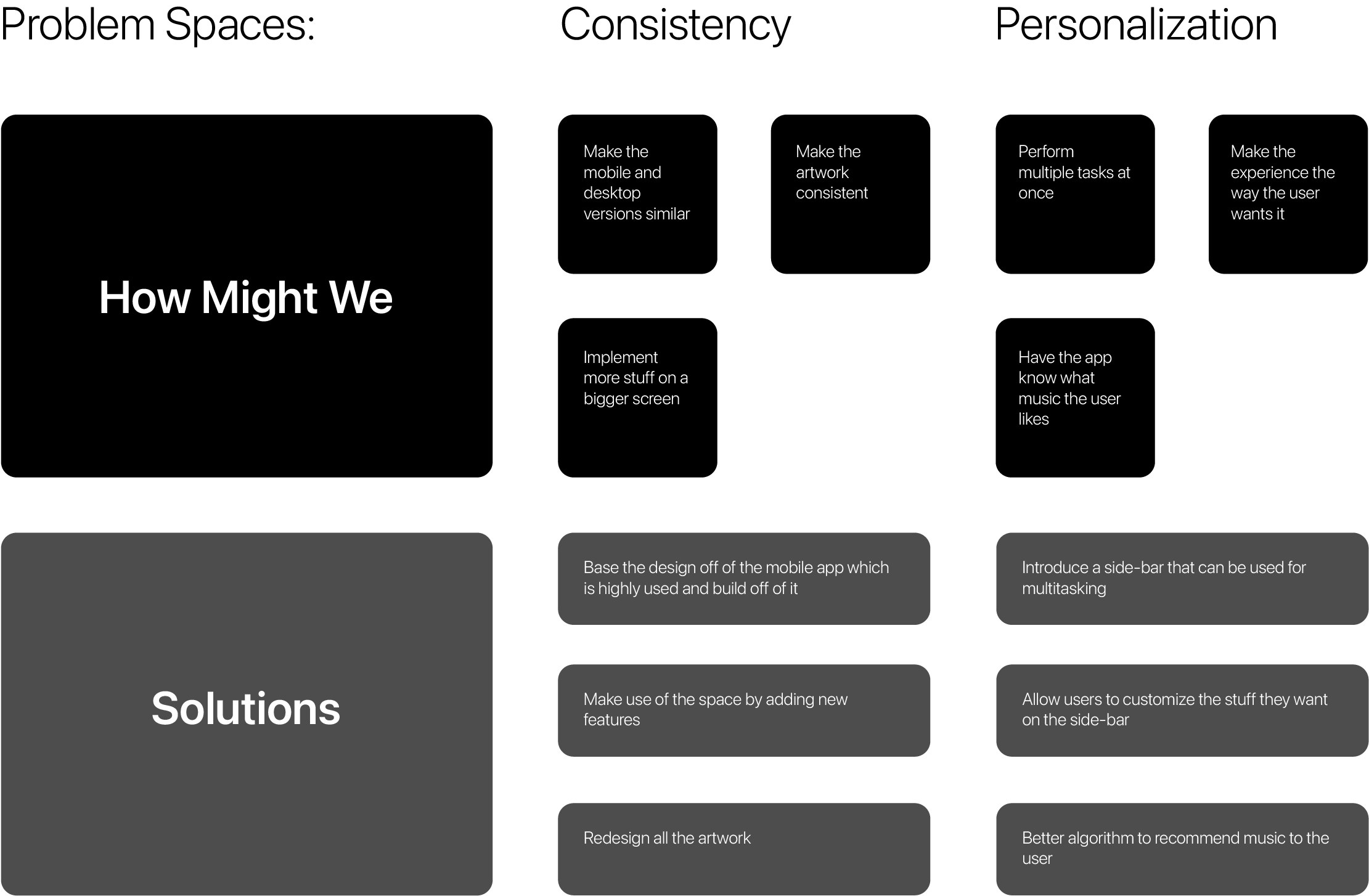
Problem Definition
It's all about how the users feel about using the product. I strive to create an overall experience where they will be happy with the functionality and intuitive nature of the interface. Based on my research, the lack of personalization and consistency were a key problem that came up so I decided to focus my redesign on those two things.
DEFINE
Ideation
I invited two people to participate in a brainstorming session and at the end of it we were able to decide on the most important aspects to focus on.
DEFINE
Solution
After performing the research and gathering all possible solutions, I narrowed it down to these four key things that I would integrate into the reimagined Apple Music.

DEFINE
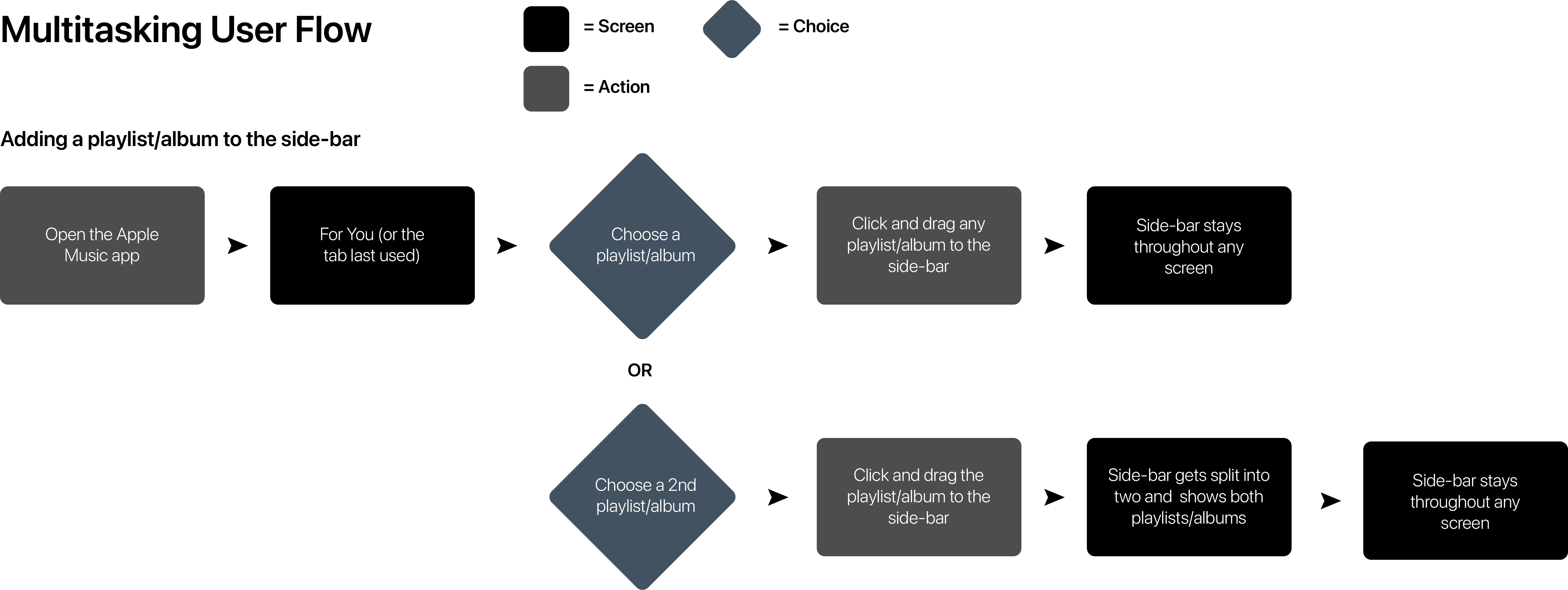
User Flow
The challenge was to figure out how and where I can place the new feature in a way that makes sense and doesn't break Apple Music's existing design patterns. So I created this basic user flow of adding a playlist/album to the side-bar to help me understand the overall process to implement.
DEVELOP + DELIVER
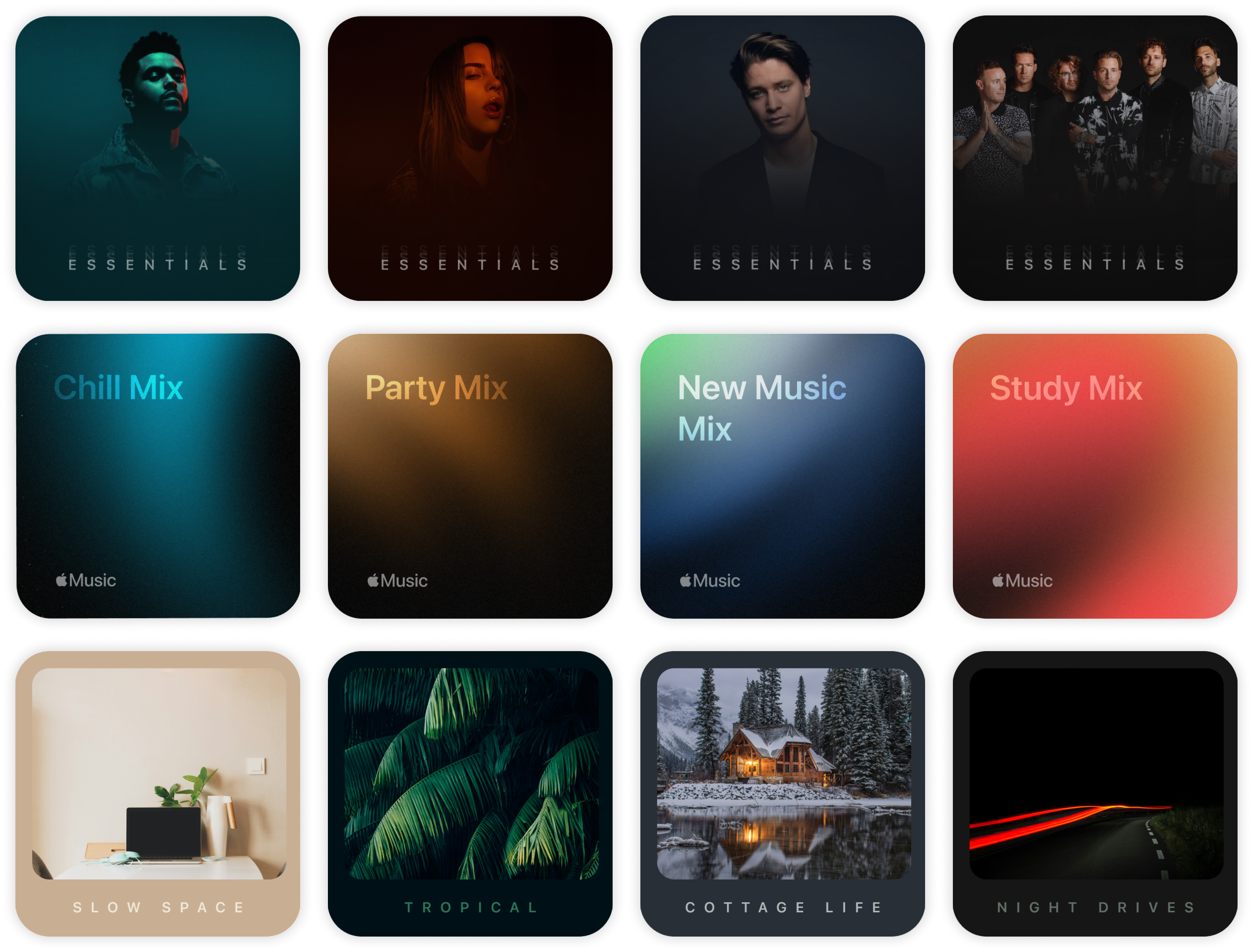
Keeping it Consistent with iOS
Sometimes big and more often little details like these go unnoticed even though they make up the overall experience. The goal was to use Apple Music's current design patterns in the mobile app so the user is familiar and can navigate through the interface seamlessly.
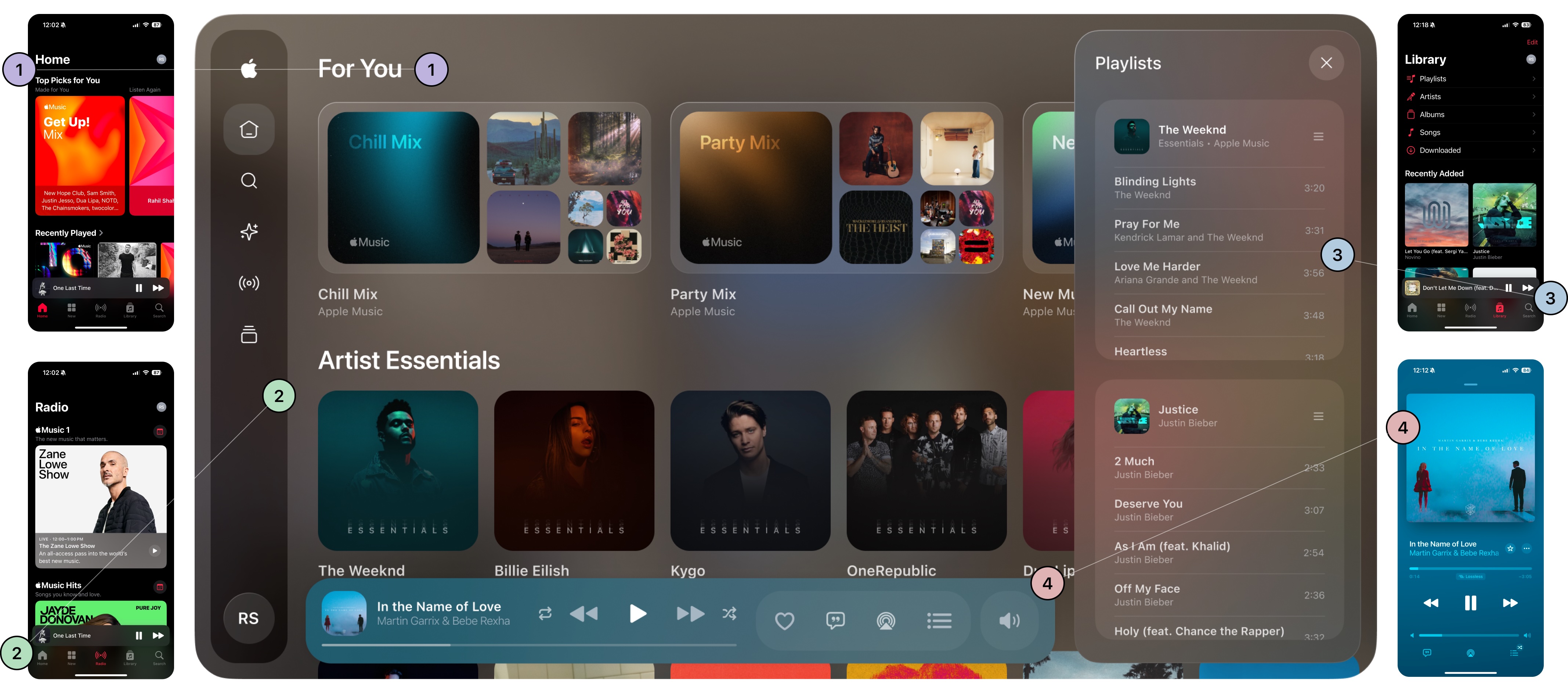
1. Typography
The typography mirrors the mobile app’s use of Apple’s San Francisco font. It maintains consistency in the headings and subheadings, ensuring familiarity across platforms. This creates a cohesive visual language that aligns the desktop experience the mobile experience.
2. Similar Menu
While the menu is more concise to maximize space for content, it retains the essential structure from the mobile app for a seamless transition between devices.
3. Same background blur
This sense of layers and blur got introduced in iOS 7 and has been a staple of Apple's OS experiences ever since. This design choice adds depth and hierarchy, making the interface feel layered and immersive while maintaining a minimalist aesthetic consistent with the mobile version.
4. Same player design
iOS 14 introduced this type of player design, with the most prominent colors of the album art blurred in the background. This detail is particularly significant as it keeps the visual identity intact across platforms. Additionally, introduced intuitive ways for the album art to expand and visually utilize the entire player, enhancing the immersive experience.
DEVELOP + DELIVER
Revamped Player
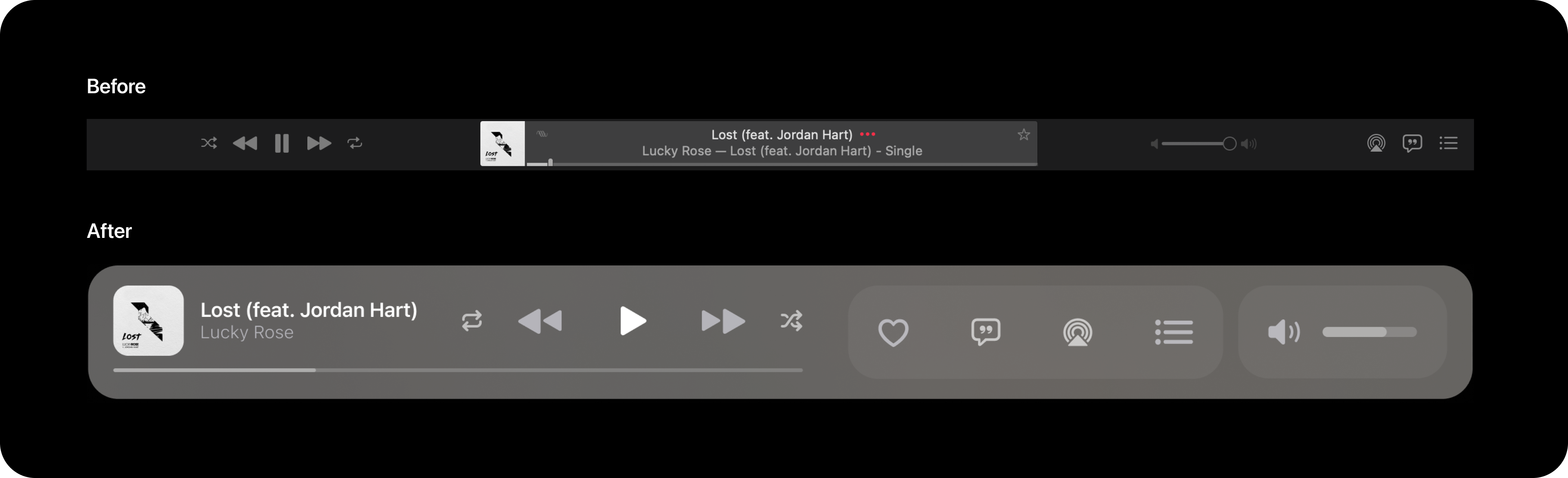
In terms of how much functionality the player can provide, I wanted to make the most of the space. The goal for the player was to prioritize simplicity, usability, and modern aesthetics. By leveraging larger touch-friendly elements, improved visual hierarchy, and a focus on the user’s primary actions, it creates a more enjoyable and intuitive listening experience. The old player also does not allow you to go to the artist page by clicking on their name in the player so that is something that I wanted to implement as well.
DEVELOP + DELIVER
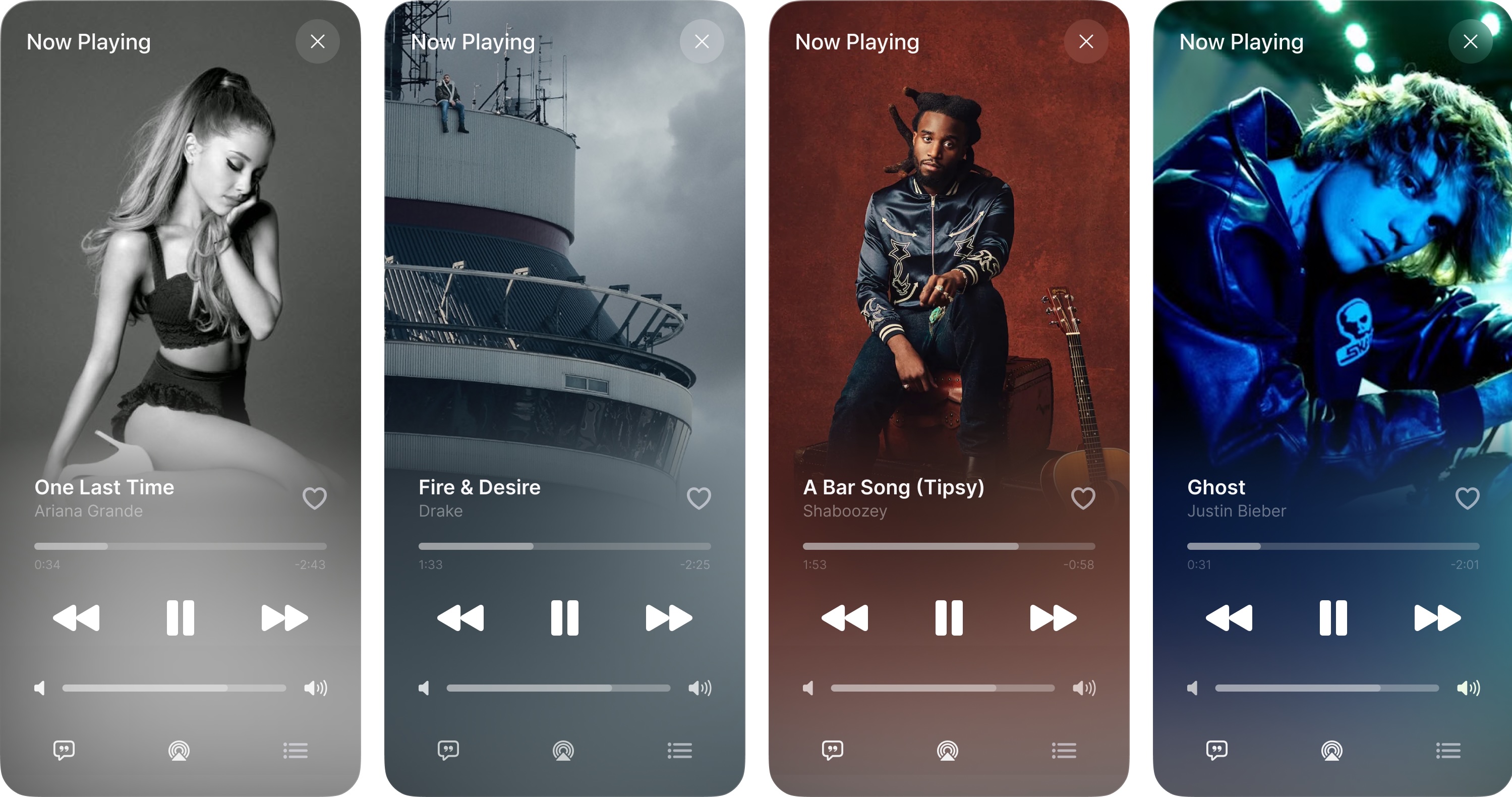
Revamped Now Playing
DEVELOP + DELIVER
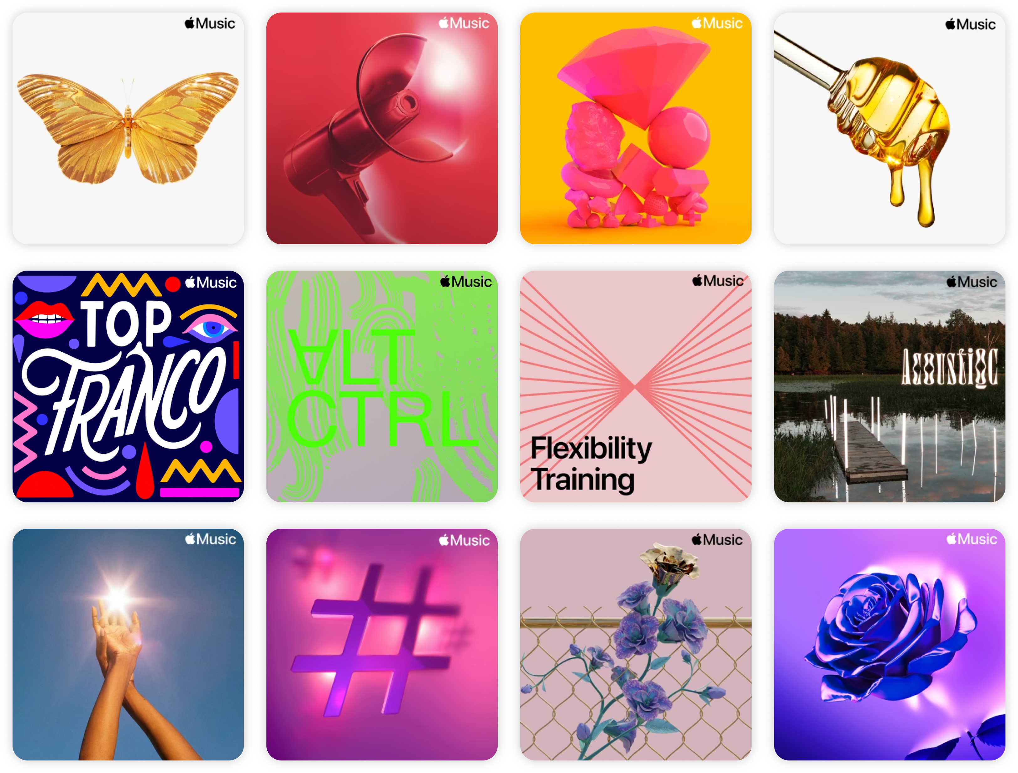
Redone Artwork
I wanted to reiterate Jason Yuan's words, "Album Artwork should be treated as part of the UI, and not a stand-alone visual component." The current aesthetic of Apple Music's album artwork doesn't quite create the sense of consistency throughout the entire interface. Users should know what they are looking for and where the text will be placed on artwork, not go searching for it (given that it is even there). On that point, some artwork doesn't have text so it can be difficult to infer what the playlist might be about.